The idea I keep embracing that pushes me out of bed every day, is art gets us through the very worst of times.
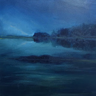
I've put my lovely pale yellows, pinks and blues aside for awhile and I can't stop with the deep blue.
The cello of deep blues.
Indigo, Cobalt, Cerulean, Linen, French, Lattier, Phthalo, Provence, Royal, St. Remy, Ultramarine and Turquoise Deep.
Maybe I'm in mourning.
I keep craving the lakes in Maine I visited as a child, Pemaquid, Biscay and Damariscotta.
I'll give it some time. I have a few more of these I'm working on.


The serene and innocent Pantone picks for 2016
don't seem relevant anymore.

Pantone is putting its money on a very hopeful green for 2017.

Those picks from Pantone always seem awkward at first,
then they find their way into our hearts,
attitudes, clothing and dishes.
So I'm going give PMS 15-0343 a chance.
attitudes, clothing and dishes.
So I'm going give PMS 15-0343 a chance.
And of course, green is next to blue on the color wheel.
